TRUCKEE, CA--(Marketwire - May 1, 2012) - Clear Capital® (www.clearcapital.com), a premium provider of data and real estate asset valuation, investment and risk assessment, today released its Home Data Index™ (HDI) Market Report with data through April 2012. The HDI Market Report uses a broad array of public and proprietary data sources providing the most timely and relevant analysis available from any vendor. Report highlights include:
- National home prices still losing ground with declines of 1.0% over the past year.
- Northeast, South and West regions are growing at rates under one percent quarter-over-quarter.
- Midwest is hit hard, with deeper depreciation in prices over quarterly and yearly timeframes.
- Price resiliency against increasing REO saturation is supported by a heating up rental market and investor enthusiasm.
"Home prices continue to show relative strength in April with virtually no change over the short term and tapering losses over the longer term," said Dr. Alex Villacorta, Director of Research and Analytics at Clear Capital.
"There has been quite a bit of buzz in the housing industry surrounding turning REOs into rentals. Our data suggests early activity from these programs could be starting to take effect, with national REO-only home price gains on a price per square foot basis vastly outpacing fair market prices on a national level," Villacorta added. "Should investor interest continue to drive the expansion of REO-to-rental programs over the next several months, there could be a significant impact on the market overall in terms of providing a rising floor to home values."
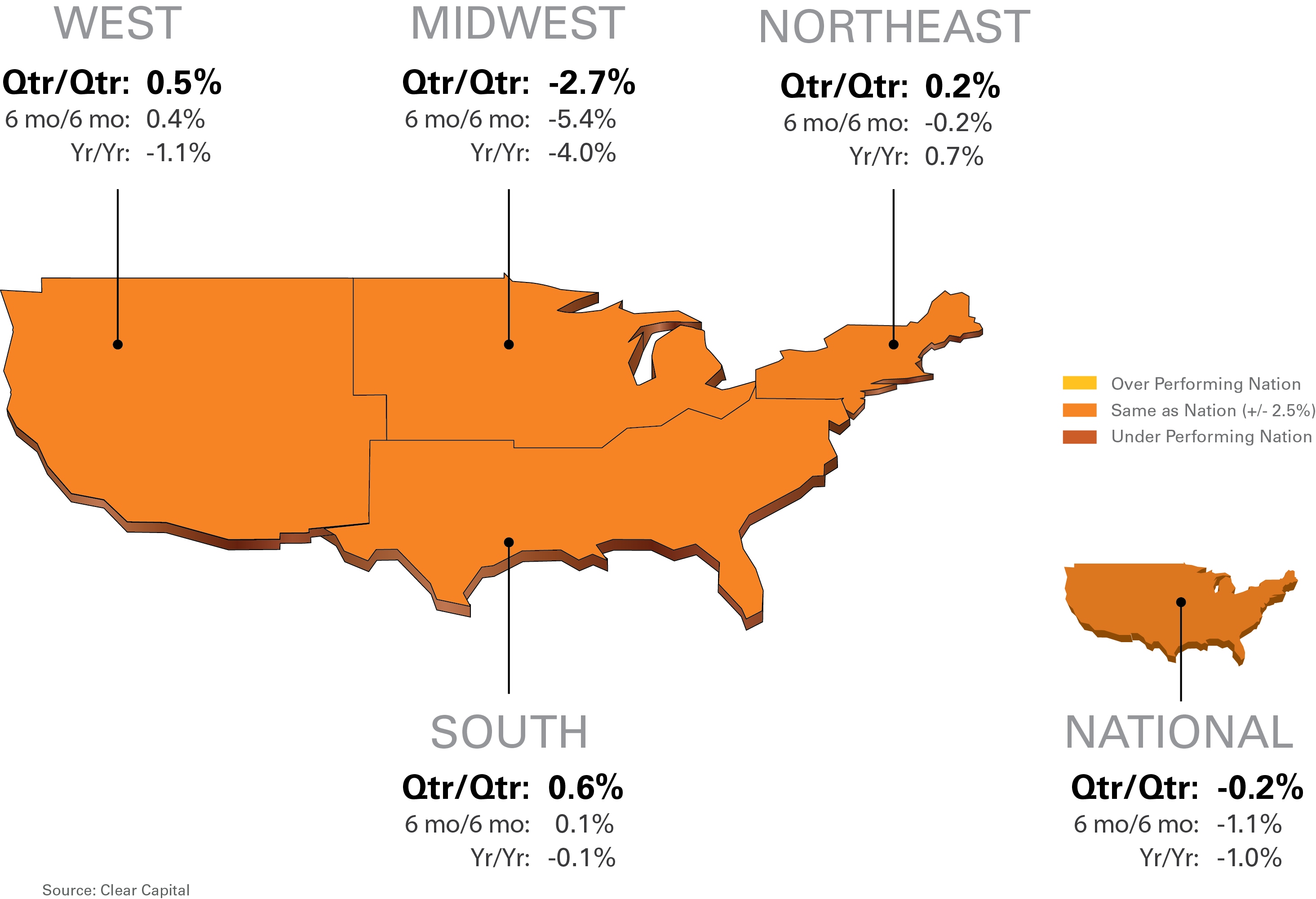
Rolling Quarter Results: All Quiet on the Western, Eastern, and Southern Fronts
Quarter-over-quarter results were notable only in how little change was seen this month, with numbers very similar with the price changes reported last month.
The nation lost a little ground with quarterly losses of -0.2%, showing continuing price stability over previous months' reports.
For the past five months, price movement at the regional level has settled in under 1.0% (except the Midwest) on a quarterly basis, which is a level of stability not seen for a decade. As the West, Northeast, and South are all in positive territory, significant losses in the Midwest are pulling down national numbers. The Midwest lost -2.7% of its value over the quarter, which is the fifth month of declines for this beleaguered region. Despite mild winter weather and an early spring, it wasn't enough to kick off a home buying season in this region. Details on national and regional price changes are shown in Chart 1.
Chart 1: Observed Results
Year-over-Year Results: Northeast is Only Region in the Black
Looking at yearly results, the nation is down -1.0% compared to last year, which is an improvement over the -1.4% loss posted in April's Market Report. The Northeast, a market that has held up well throughout the housing crisis, posted a light 0.7% increase in prices year-over-year, while the rest of the regions are still trying to climb back into positive territory.
The West and South, while still negative for the year, also saw improvements over last month's report, shrinking their annual losses by 1.4 percentage points and 0.3 percentage points respectively.
Midwest year-over-year performance paints a very different picture. Posting a loss of -4.0%, which is deeper than last month's yearly loss of -3.8%, it's not exhibiting any sign of finding a foothold for recovery like the other geographies.
Long term trends are starting to reflect the shorter term improvements we've seen for the past two months, helping to confirm that housing prices appear to be flattening with a bottom in sight.
The 15 Highest Performing MSAs
The 15 highest performing markets over the last quarter, in Chart 2 below, showed very similar price performance as compared to last month. The group had an average quarter-over-quarter growth of 3.1%, down slightly from last month's report of 3.5%, and the West contributed the most top MSAs with six of the 15.
The Phoenix market, hard hit in the housing meltdown, is starting to sizzle with quarterly values increasing 3.8 percentage points more than the next highest MSA. Phoenix also tops the Highest Performing 15 list for the second month straight, and has been either leading or in second spot on this list since the February report. However, with peak to current values at -58.2%, there is still a long way to go for Phoenix to see the values it once had.
| Highest Performing Metro Markets | ||||||||
| Qtr/Qtr Rank |
Metropolitan Statistical Area | Qtr/Qtr % +/- |
Yr/Yr | REO Saturation | ||||
| 1 | Phoenix, AZ - Mesa, AZ - Scottsdale, AZ | 8.4% | 12.5% | 29.5% | ||||
| 2 | Miami, FL - Ft. Lauderdale, FL - Miami Beach, FL | 4.6% | 9.1% | 30.2% | ||||
| 3 | Tampa, FL - St. Petersburg, FL - Clearwater, FL | 4.4% | 7.5% | 24.8% | ||||
| 4 | Richmond, VA | 4.4% | 2.3% | 25.4% | ||||
| 5 | Washington, DC - Arlington, VA - Alexandria, VA | 3.6% | 4.7% | 14.3% | ||||
| 6 | Dayton, OH | 3.4% | 6.6% | 30.5% | ||||
| 7 | Pittsburgh, PA | 2.9% | 7.3% | 8.6% | ||||
| 8 | Orlando, FL | 2.5% | 9.8% | 28.1% | ||||
| 9 | San Jose, CA - Sunnyvale, CA - Santa Clara, CA | 2.3% | 1.2% | 21.3% | ||||
| 10 | Honolulu, HI | 2.2% | 4.9% | 10.6% | ||||
| 11 | Providence, RI - New Bedford, MA - Fall River, MA | 2.1% | -4.9% | 16.4% | ||||
| 12 | NY, NY - No. New Jersey, NJ - Long Island, NY | 1.8% | 2.7% | 6.8% | ||||
| 13 | Denver, CO - Aurora, CO | 1.8% | 5.7% | 25.9% | ||||
| 14 | Fresno, CA | 1.0% | 0.4% | 41.5% | ||||
| 15 | San Francisco, CA - Oakland, CA - Fremont, CA | 1.0% | -0.5% | 29.1% | ||||
The 15 Lowest Performing MSAs
The lowest performing MSAs, in Chart 3 below, show improvement since last month with an average quarterly decline of -3.1% compared to -4.1% in April's report. The Southern region contributed the most to this group, with nine of the 15 MSAs, and the Midwest was second highest with five MSAs represented on the list.
The Milwaukee MSA is the hardest hit market this month with a dramatic quarterly loss of -12.5%. This loss is five percentage points deeper than the second hardest hit MSA, Columbus, OH, which posted a loss of -7.5%.
| Lowest Performing Major Markets | ||||||||
| Qtr/Qtr Rank |
Metropolitan Statistical Area | Qtr/Qtr % +/- |
Yr/Yr | REO Saturation | ||||
| 1 | Milwaukee, WI - Waukesha, WI - West Allis, WI | -12.5% | -9.4% | 35.9% | ||||
| 2 | Columbus, OH | -7.5% | -6.2% | 37.7% | ||||
| 3 | Birmingham, AL - Hoover, AL | -6.1% | -13.0% | 36.3% | ||||
| 4 | Memphis, TN | -5.4% | -11.4% | 48.6% | ||||
| 5 | Detroit, MI - Warren, MI - Livonia, MI | -4.2% | 1.6% | 51.1% | ||||
| 6 | Houston, TX - Baytown, TX - Sugar Land, TX | -2.0% | 4.6% | 23.6% | ||||
| 7 | Raleigh, NC - Cary, NC | -1.6% | -4.0% | 13.5% | ||||
| 8 | Nashville, TN - Davidson, TN - Murfreesboro, TN | -1.4% | -2.5% | 21.2% | ||||
| 9 | Charlotte, NC - Gastonia, NC - Concord, NC | -1.1% | -4.4% | 22.8% | ||||
| 10 | Chicago, IL - Naperville, IL - Joliet, IL | -1.0% | -4.7% | 37.8% | ||||
| 11 | New Orleans, LA - Metairie, LA - Kenner, LA | -0.9% | -3.5% | 24.6% | ||||
| 12 | St. Louis, MO - IL | -0.7% | -4.8% | 36.2% | ||||
| 13 | Baltimore, MD - Towson, MD | -0.6% | -4.8% | 13.5% | ||||
| 14 | Philadelphia, PA - Camden, NJ - Wilmington, DE | -0.6% | -8.3% | 12.2% | ||||
| 15 | Jacksonville, FL | -0.5% | -1.5% | 31.0% | ||||
REO Saturation: Continuing its Creep
The portion of national REO sales relative to total sales continued its creep in April, marking the third straight month of quarterly growth. As described in past reports, rising REO saturation is typically associated with declining home values. Chart 4 shows the changes in REO saturation since December of 2011.
| Change in REO Saturation | ||||||
| Region | REO Sat Dec | REO Sat Apr | Change (pts.) | |||
| National | 25.3% | 27.9% | 2.60 | |||
| West | 31.0% | 33.3% | 2.30 | |||
| Midwest | 31.1% | 37.1% | 6.00 | |||
| Northeast | 8.4% | 10.2% | 1.80 | |||
| South | 24.2% | 25.3% | 1.10 | |||
The price resiliency seen against rising REO saturation over the past three monthly reports is present again this month, with the exception of the Midwest. This region saw REO sales increase by a whopping 6.0% and prices decrease -2.7%.
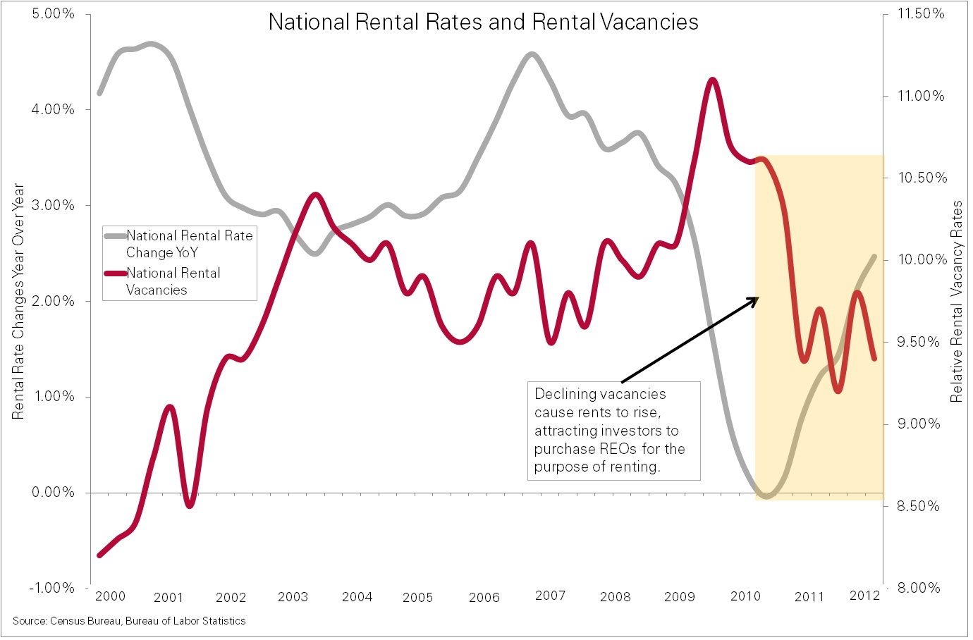
REO and Rentals
As foreclosures grew over the last six years, many homeowners became renters. This, combined with potential homebuyers putting off purchases due to market instability, has fueled an increase in demand for rental units and has buoyed rental rates.
Chart 5 shows the inverse relationship of rental vacancies to year-over-year rental rate changes. This relationship is clear since 2000, with a precipitous drop in vacancies starting in 2010 coinciding with a sharp increase in rates.
Chart 5: National Rental Rates and Vacancies
The combination of lower vacancies, increasing rental rates, and affordable REO properties has attracted investors to the rental markets. Many see the potential for strong and sometimes instant cash flows topped off with the potential for future appreciation. Carrington Holding Company, Amherst Securities Group, and Waypoint Financial are examples of investors now active in purchasing single family REOs and turning them into rentals and holding for longer terms rather than the typical short term holds. On the supply side, Fannie Mae is accepting applications from investors to bid on properties for their REO-to-Rental pilot program, with similar programs expected to roll out in coming months.
Demand for REOs is very likely a key driving force behind increasing sales prices for REO properties (as measured on a median price per square foot basis) at a much faster pace than non-REO sales. Over the last year, REO-only prices have jumped a healthy 5.5%, while fair market sales dropped 2.9%. This is a significant 8.4 percentage point difference between the two sub sectors of the national market.
Strength in REO prices is also likely a significant driving force behind the national price stability and resiliency in prices against increasing REO saturation seen over the past three months.
Going forward, the sensitive balance between REO supply and demand will help determine how market prices react to shifts in REO saturation. If REO-to-rental investment activity continues or increases, it is likely to provide the lift needed to support price increases especially as we enter the summer buying season. It's likely this balance will ebb and flow over the next several years with the markets recalibrating and normalizing along the way.
About the Clear Capital Home Data Index (HDI) Market Report
The Clear Capital HDI Market Report provides insights into market trends and other leading indices for the real estate market at the national and local levels. A critical difference in the value of the HDI Market Report is the capability of Clear Capital to provide more timely and granular reporting than other home price index providers.
The Clear Capital HDI Market Report:
- Offers the real estate industry (investors, lenders and servicers), government agencies and the public insight into the most recent pricing conditions, not only at the national and metropolitan level, but within local markets as well.
- Is built on the most recent information available from recorder/assessor offices, and then further enhanced by adding the company's proprietary streaming market data for the most comprehensive geographic coverage and local insights available.
- Reflects nationwide coverage of sales transactions and aggregates this comprehensive dataset at ten different geographic levels, including hundreds of metropolitan statistical areas (MSAs) and sub-ZIP code boundaries.
- Includes equally-weighted distressed bank owned sales (REOs) from around the country to give the most real world look of pricing dynamics across all sales types.
- Allows for the most current market data by providing more frequent updates with patent-pending rolling quarter technology. This ensures decisions are based on the most up-to-date information available.
Clear Capital Home Data Index™ Methodology
- Generates the timeliest indices in patent pending rolling quarter intervals that compare the most recent four months to the previous three months. The rolling quarters have no fixed start date and can be used to generate indices as data flows in, significantly reducing the multi-month lag time experienced with other indices.
- Includes both fair market and institutional (real estate owned) transactions, giving equal weight to all market transactions and identifying price tiers at a market specific level. By giving equal weight to all transactions the HDI is truly representative of each unique market.
- Results from an address-level cascade create an index with the most granular, statistically significant market area available.
- Provides weighted repeat sales, and price-per-square-foot index models that use multiple sale types, including single-family homes, multi-family homes and condominiums.
About Clear Capital
Clear Capital (www.clearcapital.com) is a premium provider of data and solutions for real estate asset valuation and risk assessment for large financial services companies. Our products include appraisals, broker-price opinions, property condition inspections, value reconciliations, and home data indices. Clear Capital's combination of progressive technology, high caliber in-house staff and a well-trained network of more than 40,000 field experts sets a new standard for accurate, up-to-date and well documented valuation data and assessments. The Company's customers include the largest U.S. banks, investment firms and other financial organizations.
The information contained in this report is based on sources that are deemed to be reliable; however no representation or warranty is made as to the accuracy, completeness, or fitness for any particular purpose of any information contained herein. This report is not intended as investment advice, and should not be viewed as any guarantee of value, condition, or other attribute.
Contact Information:
Media Contact:
Heather Pond
Atomic PR for Clear Capital
415.593.1400