TRUCKEE, CA--(Marketwire - Apr 5, 2012) - Clear Capital (www.clearcapital.com), a premium provider of data and real estate asset valuation, investment and risk assessment, today released its Home Data Index (HDI) Market Report with data through March 2012. The HDI Market Report uses a broad array of public and proprietary data sources providing the most timely and relevant analysis available. Methodology details are on page eight of this report.
Report highlights include:
- National home values dropped slightly in the rolling quarter-over-quarter analysis.
- Regions posted mild quarterly gains, except the struggling Midwest, which continued its downward slide.
- The year-over-year numbers showed weaker performance for the nation and the regions, indicating the short term relief has yet to be enough to turn the long term tide.
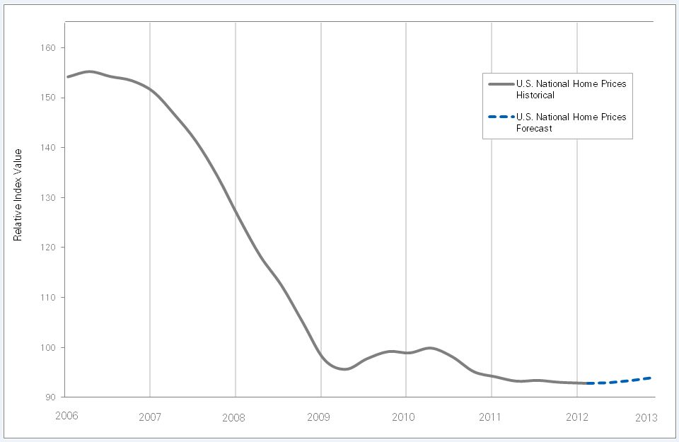
- Forecast for rest of 2012 shows mild increases building up to a stronger 1.2% by year end.
"With the exception of the Midwest, positive growth in rolling quarter-over-quarter prices is an encouraging sign that markets are rebounding from the winter slow down earlier than usual," said Dr. Alex Villacorta, Director of Research and Analytics at Clear Capital. "Even with the relatively modest declines seen over the last few months, markets have continued to show signs of bottoming out. The projections we made at the beginning of the year are playing out and we expect to see the nation gain just over 1% through the year's end.
"We are continuing to see, overall short term home value strength against the rising REO saturation." Villacorta added, "This is an indication of market stability, and bodes well for the continued growth we're expecting over the rest of the year."
Quarter-Over-Quarter Results: Is No News Good News?
Quarterly analysis highlights include:
- At the national level, home prices fell a modest -0.2% over the quarter.
- The West, South and Northeast posted gains of less than 1%, but the Midwest lost a significant -2.4%.
- REO saturation, which traditionally pushes down prices, continued to climb in all regions.
The nation held fast over the most recent quarter, and for the fifth time in six months, saw price changes of less than 1%. While the US lost -0.2% quarter-over-quarter, this decline is milder than last month's decline of -0.6%. This positive trend may be attributed to the beginning of spring after a very mild winter, resulting in the start of an early buying season.
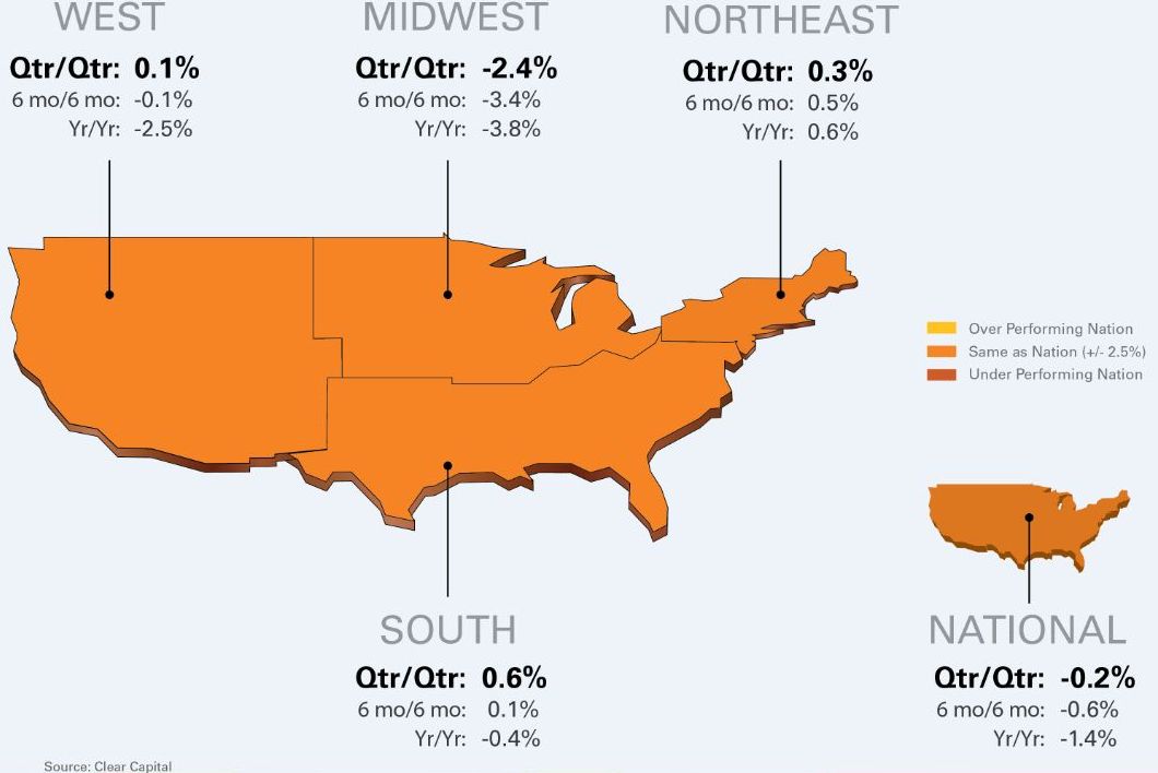
Price performance for the nation and regions, looking at short term, mid-term and long-term timeframes is shown in chart 1 below.
Chart 1: Observed Results
| Regional Market Overview | ||||||
| Qtr/Qtr | 6 mo/6 mo | Yr/Yr | ||||
| Region | % +/- | |||||
| National | -0.2% | -0.6% | -1.4% | |||
| West | 0.1% | -0.1% | -2.5% | |||
| Midwest | -2.4% | -3.4% | -3.8% | |||
| Northeast | 0.3% | 0.5% | 0.6% | |||
| South | 0.6% | 0.1% | -0.4% | |||
In looking at the quarter-over-quarter performance through March, the typically weak Western region squeezed out a minor 0.1% gain in prices over the quarter, which is a healthy improvement of over last month's losses of -0.4%, and shows long awaited upward momentum in the region that posted losses over the past five months. The embattled Midwest region, hit hard over the past three months, continued sliding this month losing -2.4%, and was the only region to post losses in the quarter or mark any quarterly price movement more than 2%. This result shows how the stability seen by the rest of the nation has yet to embrace the region.
The stable Northeast held true to form and turned in a modest 0.3% increase in prices, which was a 0.4 percentage point improvement over the quarterly loss of -0.1% posted last month.
The South turned in the strongest short term gains across the nation, with prices climbing up by 0.6%, due in part to impressive results in Florida, Texas and Virginia, all of which are well represented in the best performing MSAs listed later in the report. This gain was a healthy 0.8 percentage point improvement over the loss of -0.2% posted last month.
Year-over-Year Prices: Nation and Regions Catching Up to Short Term Gains
The year-over-year analysis found the nation lost -1.4% over the period, which is slightly better than February's year-over-year results of -1.9%, indicating a positive trend in yearly numbers.
As seen in Chart 1 above, the yearly numbers across all regions show more significant losses than the quarter-over-quarter numbers, which indicates the nation has possibly hit the bottom of a pricing "valley," with long term prices starting to reflecting the short term strength. This effect could be in play as all of the regions' yearly numbers, while still weak, are better than February's results. The consistent theme for the yearly numbers is that all regions are showing losses, with Northeast posting a small gain. This is similar to the condition seen over the past six months.
Interesting Trends in REO Saturation
For the second month in a row there have been increases in REO saturation for the nation and the regions, helping to confirm speculation the Attorneys General settlement has empowered the affected servicers to become more aggressive in moving their REO backlog onto the housing market.
In March, the national REO rate went up 1.2 points since last month and 1.8 points over the past quarter to hit 27%, pointing to an acceleration of REO sales. The Midwest contributed the most to the increase, jumping 3.8 points over the quarter to 34.3%, with the other regions all seeing softer increases. Chart 2 below shows changes in REO saturation across the nation and regions.
Chart 2: REO Saturation for US and Regions
| Change in REO Saturation | ||||||
| Region | REO Sat Nov | REO Sat Mar | Change (pts.) | |||
| National | 25.2% | 27.0% | 1.8 | |||
| West | 30.9% | 33.2% | 2.3 | |||
| Midwest | 30.5% | 34.3% | 3.8 | |||
| Northeast | 8.0% | 9.4% | 1.4 | |||
| South | 24.4% | 24.7% | 0.3 | |||
Of particular interest this month is how these changes in REO saturation are affecting prices. In the past, there has been a consistent inverse relationship between changes in REO saturation and prices, but not this month.
While chart 2 shows the nation and all regions saw increases in REO saturation over the most recent quarter, changes in prices over the same period shown in chart 1 were positive for the West, Northeast, and South, describing an unexpected direct relationship. The US and Midwest's changes in prices over the same period were downward, describing the expected inverse relationship.
The geographies with direct relationships show a pricing resilience to REO saturation that has not been seen in previous HDI analysis. It could be powered by improvement in the jobs numbers recently, rapidly increasing investor activity in certain regions, and the general increase in consumer confidence.
Micro Market Analysis: Less Volatility for Both Groups
Clear Capital analyzes 50 MSAs and creates a list of the 15 highest performing and 15 lowest performing micro-markets based on rolling quarter-over-quarter performance.
Highest Performing MSAs
The 15 highest performing markets, shown in chart 3 below, come from a variety of regions, with the South providing the strong majority with 47%.
Chart 3: Highest Performing MSAs
| Highest Performing Metro Markets | ||||||||
| Qtr/Qtr | Qtr/Qtr | REO | ||||||
| Rank | Metropolitan Statistical Area | % +/- | Yr/Yr | Saturation | ||||
| 1 | Phoenix, AZ - Mesa, AZ - Scottsdale, AZ | 7.3% | 9.9% | 31.0% | ||||
| 2 | Dayton, OH | 6.3% | 8.4% | 26.2% | ||||
| 3 | Pittsburgh, PA | 6.1% | 10.7% | 8.3% | ||||
| 4 | Washington, DC - Arlington, VA - Alexandria, VA | 5.0% | 5.3% | 12.6% | ||||
| 5 | Richmond, VA | 4.1% | 0.9% | 22.9% | ||||
| 6 | Orlando, FL | 3.7% | 10.9% | 26.6% | ||||
| 7 | Tampa, FL - St. Petersburg, FL - Clearwater, FL | 3.6% | 6.0% | 24.5% | ||||
| 8 | Houston, TX - Baytown, TX - Sugar Land, TX | 3.2% | 3.2% | 24.8% | ||||
| 9 | Providence, RI - New Bedford, MA - Fall River, MA | 3.2% | 3.5% | 16.3% | ||||
| 10 | Minneapolis, MN - St. Paul, MN - Bloomington, WI | 2.9% | 1.1% | 39.7% | ||||
| 11 | Miami, FL - Ft. Lauderdale, FL - Miami Beach, FL | 2.3% | 7.9% | 30.3% | ||||
| 12 | Virginia Beach, VA - Norfolk, VA - Newport News, VA | 1.7% | 0.7% | 19.9% | ||||
| 13 | NY, NY - No. New Jersey, NJ - Long Island, NY | 1.4% | 2.4% | 6.7% | ||||
| 14 | Hartford, CT - West Hartford, CT - East Hartford, CT | 1.3% | 1.8% | 6.9% | ||||
| 15 | Denver, CO - Aurora, CO | 1.2% | 3.4% | 26.3% | ||||
The results for this group have less variability than seen in previous months with a floor of at least 1% positive growth quarter-over-quarter and the vast majority (11 of the 15) posting growth of less than 5% over the quarter.
As a group, they averaged a quarterly gain of 3.5%, which is a 1.1 point gain over last month's market report. Also notable is for the first time since June of 2010, each market on the highest performing list saw yearly gains as well.
The Lowest Performing MSAs
The lowest performing 15 markets, shown in chart 4 below, are surprisingly consistent with last month's group. They posted a quarterly average loss of -4.1%, the same as last month's report, and had similar variances across markets. The Midwest and South made up 40% of this group's markets, which is understandable for the Midwest, but unusual for the South as it was the strongest region for quarterly performance and represented the majority of the best performing group as well.
Outside of the -14.0% loss for the Birmingham and Hoover, Alabama market, no other MSA in the lowest performing group saw double digit quarterly losses. The average REO saturation for this group of MSAs held at 31%, which is the same as last month's report, with all markets exhibiting the more expected inverse relationship between changes in prices and REO saturation.
Chart 4: Lowest Performing MSAs
| Lowest Performing Metro Markets | ||||||||
| Qtr/Qtr | Qtr/Qtr | REO | ||||||
| Rank | Metropolitan Statistical Area | % +/- | Yr/Yr | Saturation | ||||
| 1 | Birmingham, AL - Hoover, AL | -14.0% | -16.5% | 38.9% | ||||
| 2 | Milwaukee, WI - Waukesha, WI - West Allis, WI | -9.5% | -6.8% | 29.6% | ||||
| 3 | Detroit, MI - Warren, MI - Livonia, MI | -6.9% | -7.1% | 51.0% | ||||
| 4 | Memphis, TN | -5.1% | -6.5% | 40.7% | ||||
| 5 | Seattle, WA - Tacoma, WA - Bellevue, WA | -4.0% | -15.0% | 22.6% | ||||
| 6 | New Orleans, LA - Metairie, LA - Kenner, LA | -3.1% | -7.1% | 25.4% | ||||
| 7 | Columbus, OH | -3.0% | -1.0% | 32.8% | ||||
| 8 | Cleveland, OH - Elyria, OH - Mentor, OH | -3.0% | -0.9% | 38.4% | ||||
| 9 | Jacksonville, FL | -3.0% | -3.0% | 29.6% | ||||
| 10 | Atlanta, GA - Sandy Springs, GA - Marietta, GA | -2.9% | -17.7% | 46.6% | ||||
| 11 | Philadelphia, PA - Camden, NJ - Wilmington, DE | -2.2% | -8.4% | 11.1% | ||||
| 12 | Charlotte, NC - Gastonia, NC - Concord, NC | -1.5% | -5.7% | 16.6% | ||||
| 13 | Chicago, IL - Naperville, IL - Joliet, IL | -1.3% | -4.4% | 35.7% | ||||
| 14 | San Jose, CA - Sunnyvale, CA - Santa Clara, CA | -1.3% | -2.2% | 18.6% | ||||
| 15 | Cincinnati, OH - Middletown, OH | -1.3% | -6.6% | 26.8% | ||||
Forecast for Remainder of 2012
The forecast models predict the nation's prices to increase modestly over the next three months and increase to 1.2% growth by the end of the year. This shows the valley shape (shown in chart 5) with current prices at the bottom and an upward trend from now (March) through December of 2012.
The strongest of the regions throughout much of 2011, the Northeast, is expected to gain a modest 0.3% over the next three months, but pick up momentum and grow prices by 1.3% to wrap up the year. The South is expected to perform the strongest in the short term, growing 0.5% over the next three months, and end the year with 1.6% growth, exceeding the national forecast by 0.4 percentage points.
The forecast shows the Western region could be turning a corner. The three month numbers show the region gaining 0.2%, and pushing that to a positive 1% to end the year. The Midwest is expected to drop -0.6% over the next three months, but move into positive territory with a 0.7% gain by December.
MSAs Expected to See Modest Growth
The 50 MSAs tracked by Clear Capital are forecasted to show mixed gains and losses, with 30 markets expected to see gains and 20 markets projected to post losses through the end of 2012. A full 52% of the 50 metros should see prices move less than 2% in either direction. No double digit declines are expected, and only Phoenix and Tampa are expected to see double digit gains. The forecasts for all 50 MSAs from March to December are shown in chart 6 below:
Chart 6: Forecast from March 2012 to December 2012
| Metro 50 Forecast | ||||
| Rank | Metropolitan Statistical Area | Forecast to End of 2012 |
||
| 1 | Phoenix, AZ - Mesa, AZ - Scottsdale, AZ | 12.1% | ||
| 2 | Tampa, FL - St. Petersburg, FL - Clearwater, FL | 11.4% | ||
| 3 | Orlando, FL | 9.0% | ||
| 4 | Washington, DC - Arlington, VA - Alexandria, VA | 8.4% | ||
| 5 | Las Vegas, NV - Paradise, NV | 6.6% | ||
| 6 | Miami, FL - Ft. Lauderdale, FL - Miami Beach, FL | 6.0% | ||
| 7 | Houston, TX - Baytown, TX - Sugar Land, TX | 4.3% | ||
| 8 | Providence, RI - New Bedford, MA - Fall River, MA | 4.0% | ||
| 9 | Cleveland, OH - Elyria, OH - Mentor, OH | 3.7% | ||
| 10 | NY, NY - No. New Jersey, NJ - Long Island, NY | 3.4% | ||
| 11 | Louisville, KY | 3.4% | ||
| 12 | Fresno, CA - Madera, CA | 2.9% | ||
| 13 | San Diego, CA - Carlsbad, CA - San Marcos, CA | 2.6% | ||
| 14 | Virginia Beach, VA - Norfolk, VA - Newport News, VA | 2.3% | ||
| 15 | Birmingham, AL - Hoover, AL | 2.2% | ||
| 16 | Baltimore, MD - Towson, MD | 1.9% | ||
| 17 | Denver, CO - Aurora, CO | 1.8% | ||
| 18 | Portland, OR - Vancouver, WA - Beaverton, OR | 1.8% | ||
| 19 | New Orleans, LA - Metairie, LA - Kenner, LA | 1.6% | ||
| 20 | Dayton, OH | 1.5% | ||
| 21 | Honolulu, HI | 1.5% | ||
| 22 | Hartford, CT - West Hartford, CT - East Hartford, CT | 1.3% | ||
| 23 | Richmond, VA | 1.3% | ||
| 24 | Pittsburgh, PA | 1.3% | ||
| 25 | Riverside, CA - San Bernardino, CA - Ontario, CA | 1.2% | ||
| 26 | Minneapolis, MN - St. Paul, MN - Bloomington, WI | 1.0% | ||
| 27 | Dallas, TX - Fort Worth, TX - Arlington, TX | 0.8% | ||
| 28 | Sacramento, CA - Arden, CA - Roseville, CA | 0.6% | ||
| 29 | Boston, MA - Cambridge, MA - Quincy, MA | 0.5% | ||
| 30 | Los Angeles, CA - Long Beach, CA - Santa Ana, CA | 0.5% | ||
| 31 | Bakersfield, CA | 0.0% | ||
| 32 | St. Louis, MO | -0.2% | ||
| 33 | Memphis, TN | -0.2% | ||
| 34 | Rochester, NY | -0.3% | ||
| 35 | San Francisco, CA - Oakland, CA - Fremont, CA | -0.5% | ||
| 36 | Columbus, OH | -0.5% | ||
| 37 | Nashville, TN - Davidson, TN - Murfreesboro, TN | -0.5% | ||
| 38 | Tucson, AZ | -0.5% | ||
| 39 | San Jose, CA - Sunnyvale, CA - Santa Clara, CA | -0.6% | ||
| 40 | Oxnard, CA - Thousand Oaks, CA - Ventura, CA | -1.4% | ||
| 41 | Raleigh, NC - Cary, NC | -1.7% | ||
| 42 | Milwaukee, WI - Waukesha, WI - West Allis, WI | -2.3% | ||
| 43 | Cincinnati, OH - Middletown, OH | -2.4% | ||
| 44 | Jacksonville, FL | -2.7% | ||
| 45 | Detroit, MI - Warren, MI - Livonia, MI | -3.1% | ||
| 46 | Charlotte, NC - Gastonia, NC - Concord, NC | -4.4% | ||
| 47 | Philadelphia, PA - Camden, NJ - Wilmington, DE | -4.7% | ||
| 48 | Chicago, IL - Naperville, IL - Joliet, IL | -5.1% | ||
| 49 | Seattle, WA - Tacoma, WA - Bellevue, WA | -7.7% | ||
| 50 | Atlanta, GA - Sandy Springs, GA - Marietta, GA | -8.3% | ||
About the Clear Capital Home Data Index (HDI) Market Report
The Clear Capital HDI Market Report provides insights into market trends and other leading indices for the real estate market at the national and local levels. A critical difference in the value of the HDI Market Report is the capability of Clear Capital to provide more timely and granular reporting than other home price index providers.
The Clear Capital HDI Market Report:
- Offers the real estate industry (investors, lenders and servicers), government agencies and the public insight into the most recent pricing conditions, not only at the national and metropolitan level, but within local markets as well.
- Is built on the most recent information available from recorder/assessor offices, and then further enhanced by adding the company's proprietary streaming market data for the most comprehensive geographic coverage and local insights available.
- Reflects nationwide coverage of sales transactions and aggregates this comprehensive dataset at ten different geographic levels, including hundreds of metropolitan statistical areas (MSAs) and sub-ZIP code boundaries.
- Includes equally-weighted distressed bank owned sales (REOs) from around the country to give the most real world look of pricing dynamics across all sales types.
- Allows for the most current market data by providing more frequent updates with patent-pending rolling quarter technology. This ensures decisions are based on the most up-to-date information available.
Clear Capital Home Data Index™ Methodology
- Generates the timeliest indices in patent pending rolling quarter intervals that compare the most recent four months to the previous three months. The rolling quarters have no fixed start date and can be used to generate indices as data flows in, significantly reducing the multi-month lag time experienced with other indices.
- Includes both fair market and institutional (real estate owned) transactions, giving equal weight to all market transactions and identifying price tiers at a market specific level. By giving equal weight to all transactions the HDI is truly representative of each unique market.
- Results from an address-level cascade create an index with the most granular, statistically significant market area available.
- Provides weighted repeat sales, and price-per-square-foot index models that use multiple sale types, including single-family homes, multi-family homes and condominiums.
About Clear Capital
Clear Capital (www.clearcapital.com) is a premium provider of data and solutions for real estate asset valuation and risk assessment for large financial services companies. Our products include appraisals, broker-price opinions, property condition inspections, value reconciliations, and home data indices. Clear Capital's combination of progressive technology, high caliber in-house staff and a well-trained network of more than 40,000 field experts sets a new standard for accurate, up-to-date and well documented valuation data and assessments. The Company's customers include the largest U.S. banks, investment firms and other financial organizations.
The information contained in this report is based on sources that are deemed to be reliable; however no representation or warranty is made as to the accuracy, completeness, or fitness for any particular purpose of any information contained herein. This report is not intended as investment advice, and should not be viewed as any guarantee of value, condition, or other attribute.
Contact Information:
Media Contact:
Heather Pond
Atomic PR for Clear Capital
415.593.1400