TRUCKEE, CA--(Marketwire - Jun 5, 2012) - Clear Capital® (www.clearcapital.com), a premium provider of data and real estate asset valuation, investment and risk assessment, today released its Home Data Index™ (HDI) Market Report with data through May 2012. The HDI Market Report uses a broad array of public and proprietary data sources providing the most timely and relevant analysis available from any vendor. Report highlights include:
- National home prices grew on both a quarterly and yearly basis for the first time since August 2010.
- Regional performance improved across the board with the West, South and Northeast also seeing quarterly and yearly gains.
- The Midwest sustained declines, but milder since last month's Market Report.
- REO-only price performance helps shed light on why certain markets are performing better than others.
"National real estate prices in May have finally moved past the continued losses of the last few years. The subsequent stabilization pattern seen in recent months has progressed into the start of moderate growth," said Dr. Alex Villacorta, Director of Research and Analytics at Clear Capital.
"While gains in national home prices over the quarter and year were minimal in May, there are encouraging trends continuing to play out and gaining momentum beneath the surface," Villacorta added. "Strength in REO-only price trends as well as some early indications of price gains spreading from low tier sectors to the mid-, and higher-priced homes is helping confirm that the country continues to make progress on its recovery, and we are expecting to see improvements extend over the next several months."
Rolling Quarter Results: Prices are Gaining Ground
Short-term quarterly price trends picked up slightly at the national level, with appreciation of 0.4% turning into the first quarterly gain since November of 2011. The positive move at the broader market level is a reflection of the increasing strength at the regional level.
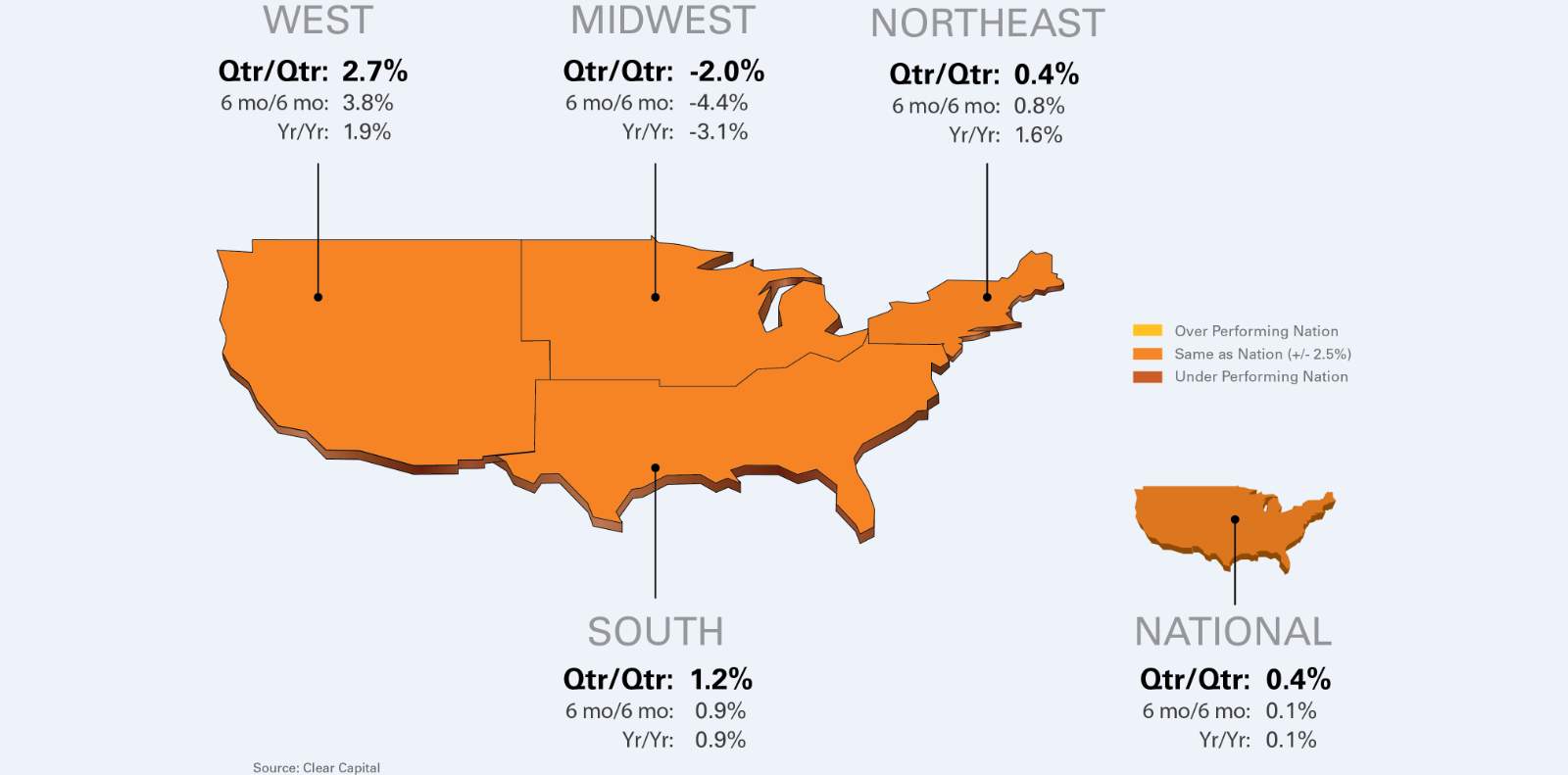
Helping to support growth at the national level, the West saw a notable jump in prices over the quarter, taking the lead over all the regions with growth of 2.7% (shown in Chart 1 below). The 2.2 percentage point gain over last month's report not only put the West out in front of the other regions tracked, but it marks the first time in five months it saw a quarterly change in any direction greater than 1.0%.
Fueling the growth in the West appears to be a shift in demand. Over the past year, the real strength in the West was seen in the lower priced home segment (those selling for $140,000 and less), likely indicating increasing investor demand for the lower priced units. While this trend isn't unique to the West, recent growth in the mid and top-tier sectors of the market is. Over the last rolling quarter, mid and top tier segments not only saw growth (top tier is a price point over $347,000), but started catching up to the gains in the lower tier. This new dynamic is encouraging, as it shows a broadening demand and a stronger base for growth.
Meanwhile, the South recorded home price appreciation of 1.2% quarter-over-quarter, doubling the small gains of 0.6% reported on last month. Similarly, the Northeast matched the national level gains of 0.4% over the quarter, showing a modest uptick over the gains of 0.2% reported last month.
At the same time, the Midwest continued to absorb price declines. With prices declining only 2.0% over the quarter the magnitude of the declines are subsiding, as compared to last month's quarterly losses of 2.7%. More on what's driving the Midwest price declines below in the "Turning the Corner" section.
Chart 1: Observed Results
| Qtr/Qtr % +/- |
6 mo/6 mo |
Yr/Yr | |
| West | 2.7% | 3.8% | 1.9% |
| Midwest | -2.0% | -4.4% | -3.1% |
| Northeast | 0.4% | 0.8% | 1.6% |
| South | 1.2% | 0.9% | 0.9% |
| National | 0.4% | 0.1% | 0.1% |
Year-over-Year Results: Long Term Trends Turning Positive
Mirroring the quarter-over-quarter results, the longer-term yearly price changes at the national and regional levels also showed improvement. The national results show a mild 0.1% gain, which is the first time the U.S. has seen yearly gains since September of 2010, when price growth was fueled by the first-time home buyer tax credit in place at the time.
The West, Northeast and Southern regions all recorded more substantial gains over the past year, of 1.9%, 1.6% and 0.9%, respectively. This appreciation in prices over last year was in part furnished by a stronger than typical winter home buying season, where mild weather got homebuyers out on the hunt and motivated earlier than usual.
The Midwest has clearly not seen the same strength of the other regions, with price declines of 3.1% over the last year. However, this month's annual declines are softer than last month's reported losses of 4.0%, which aligns with the moderating losses in quarterly trends as well.
The Highest Performing 15 MSAs
Overall, the top 15 MSAs extended improvements. The average quarterly gain of this group was 4.5%, more than a full percentage point above last month's average. Each top metro also recorded quarterly gains in excess of 2%, making May's top 15 metros the strongest since September of 2011. This group is represented by a variety of regions, with the majority (40%) coming from the West.
| Highest Performing Metro Markets | ||||
| Qtr/Qtr Rank |
Metropolitan Statistical Area | Qtr/Qtr % +/- |
Yr/Yr | REO Saturation |
| 1 | Phoenix, AZ - Mesa, AZ - Scottsdale, AZ | 9.4% | 17.0% | 25.6% |
| 2 | Seattle, WA - Tacoma, WA - Bellevue, WA | 9.0% | -1.1% | 19.5% |
| 3 | Dayton, OH | 8.3% | 9.0% | 30.3% |
| 4 | Washington, DC - Arlington, VA - Alexandria, VA | 5.1% | 7.5% | 13.9% |
| 5 | San Jose, CA - Sunnyvale, CA - Santa Clara, CA | 5.1% | 3.3% | 20.1% |
| 6 | Miami, FL - Ft. Lauderdale, FL - Miami Beach, FL | 4.7% | 10.6% | 28.8% |
| 7 | Minneapolis, MN - St. Paul, MN - Bloomington, WI | 4.7% | 9.0% | 40.5% |
| 8 | Denver, CO - Aurora, CO | 2.9% | 9.0% | 22.5% |
| 9 | Pittsburgh, PA | 2.9% | 9.4% | 7.6% |
| 10 | San Francisco, CA - Oakland, CA - Fremont, CA | 2.7% | 2.4% | 27.6% |
| 11 | Virginia Beach, VA - Norfolk, VA - Newport News, VA | 2.7% | 2.8% | 17.9% |
| 12 | Tucson, AZ | 2.7% | -1.8% | 38.5% |
| 13 | Tampa, FL - St. Petersburg, FL - Clearwater, FL | 2.5% | 9.0% | 26.0% |
| 14 | Richmond, VA | 2.5% | 3.0% | 23.0% |
| 15 | Hartford, CT - West Hartford, CT - East Hartford, CT | 2.4% | 9.4% | 8.0% |
The Lowest Performing 15 MSAs
The lowest performing MSAs averaged quarterly losses of 2.8%, but these declines tapered slightly over the average losses posted in last month's report. Additionally, a third of the markets saw less than a 1.0% quarterly loss, which is another indication that losses are becoming less severe overall.
It's worth noting that Orlando has made an appearance on the lowest performing market list, with quarterly declines of only 0.2%. The region continues to show year-over-year price gains of 8.9%, however the slight cooling of short term price performance is far from confirmation that the metro's progress has subsided.
| Lowest Performing Major Markets | ||||
| Qtr/Qtr Rank |
Metropolitan Statistical Area | Qtr/Qtr % +/- |
Yr/Yr | REO Saturation |
| 1 | Detroit, MI - Warren, MI - Livonia, MI | -10.4% | -5.4% | 53.8% |
| 2 | Houston, TX - Baytown, TX - Sugar Land, TX | -5.9% | 5.7% | 22.5% |
| 3 | Milwaukee, WI - Waukesha, WI - West Allis, WI | -5.2% | -8.1% | 35.1% |
| 4 | Memphis, TN | -4.3% | -8.6% | 45.4% |
| 5 | Honolulu, HI | -3.8% | 0.3% | 9.0% |
| 6 | Dallas, TX - Fort Worth, TX - Arlington, TX | -3.4% | 4.5% | 21.5% |
| 7 | Columbus, OH | -2.9% | -0.1% | 34.8% |
| 8 | Providence, RI - New Bedford, MA - Fall River, MA | -2.4% | -8.2% | 14.7% |
| 9 | Raleigh, NC - Cary, NC | -1.2% | -4.6% | 19.2% |
| 10 | Nashville, TN - Davidson, TN - Murfreesboro, TN | -1.0% | -2.0% | 21.4% |
| 11 | New Orleans, LA - Metairie, LA - Kenner, LA | -0.8% | -1.2% | 22.1% |
| 12 | Philadelphia, PA - Camden, NJ - Wilmington, DE | -0.5% | -8.3% | 13.8% |
| 13 | Oxnard, CA - Thousand Oaks, CA - Ventura, CA | -0.2% | -4.0% | 32.8% |
| 14 | Cincinnati, OH - Middletown, OH | -0.2% | -2.2% | 28.9% |
| 15 | Orlando, FL | -0.2% | 8.9% | 30.2% |
Turning the Corner
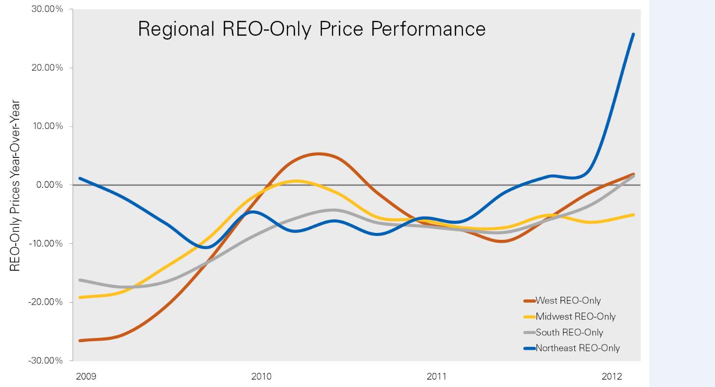
The price gains seen at the national, regional and metro levels are being driven in part by the significant increases in REO-only prices. In fact, national REO-only gains of 8.1% over the last year on a median price-per-square-foot basis have outpaced non-REO price declines of -0.7% by 8.8 percentage points. Looking at REO-only prices on a year-over-year basis helps highlight why the Midwest lags the other regions in overall growth.
Chart 2: Regional REO-Only Prices (see image 2 for reference)
While growth in REO-only prices is driving broader market gains for most of the regions, the impact on overall prices depends on the level of REO saturation. For example, the Northeast has seen incredible growth in the REO-only sector shown above, yet has only recorded 1.6% gains year-over-year in overall prices. Because the Northeast has a mere 10% REO saturation, the lowest level across all regions, even substantial growth in the REO-only price segment hasn't swayed overall prices significantly. Additionally, the Northeast's REO-only prices are more sensitive to shifting demand, fueling the seemly high annual gains.
Clearly the Midwest is the only region that continues to see REO-only price declines on a year over year basis. While REO-only price growth has led the other regions into broader based growth, the Midwest has yet to receive assistance from this sector on overall progress. It's worth noting that the Midwest's REO saturation levels are still the highest of all the regions. As such, price weakness in the REO-only segment has been harder for the market to shake off, resulting in sustained declines at the broader level, as seen in overall yearly declines of 3.1%.
However, each of the three regions now seeing gains in REO-only prices, first saw long term reductions in REO saturation rates. And while the Midwest continues to face declines, it has achieved a reduction in its REO saturation rate over the last several years, from a high of 45% in 2009, down to 37% in May.
So while the West, South, and Northeastern regions have been able to find their way into positive territory, the embattled Midwest also appears to be on the path to recovery, but just running a bit behind schedule.
About the Clear Capital Home Data Index (HDI) Market Report
The Clear Capital HDI Market Report provides insights into market trends and other leading indices for the real estate market at the national and local levels. A critical difference in the value of the HDI Market Report is the capability of Clear Capital to provide more timely and granular reporting than other home price index providers.
The Clear Capital HDI Market Report:
- Offers the real estate industry (investors, lenders and servicers), government agencies and the public insight into the most recent pricing conditions, not only at the national and metropolitan level, but within local markets as well.
- Is built on the most recent information available from recorder/assessor offices, and then further enhanced by adding the company's proprietary streaming market data for the most comprehensive geographic coverage and local insights available.
- Reflects nationwide coverage of sales transactions and aggregates this comprehensive dataset at ten different geographic levels, including hundreds of metropolitan statistical areas (MSAs) and sub-ZIP code boundaries.
- Includes equally-weighted distressed bank owned sales (REOs) from around the country to give the most real world look of pricing dynamics across all sales types.
- Allows for the most current market data by providing more frequent updates with patent-pending rolling quarter technology. This ensures decisions are based on the most up-to-date information available.
Clear Capital Home Data Index™ Methodology
- Generates the timeliest indices in patent pending rolling quarter intervals that compare the most recent four months to the previous three months. The rolling quarters have no fixed start date and can be used to generate indices as data flows in, significantly reducing the multi-month lag time experienced with other indices.
- Includes both fair market and institutional (real estate owned) transactions, giving equal weight to all market transactions and identifying price tiers at a market specific level. By giving equal weight to all transactions the HDI is truly representative of each unique market.
- Results from an address-level cascade create an index with the most granular, statistically significant market area available.
- Provides weighted repeat sales, and price-per-square-foot index models that use multiple sale types, including single-family homes, multi-family homes and condominiums.
About Clear Capital
Clear Capital (www.clearcapital.com) is a premium provider of data and solutions for real estate asset valuation and risk assessment for large financial services companies. Our products include appraisals, broker-price opinions, property condition inspections, value reconciliations, and home data indices. Clear Capital's combination of progressive technology, high caliber in-house staff and a well-trained network of more than 40,000 field experts sets a new standard for accurate, up-to-date and well documented valuation data and assessments. The Company's customers include the largest U.S. banks, investment firms and other financial organizations.
The information contained in this report is based on sources that are deemed to be reliable; however no representation or warranty is made as to the accuracy, completeness, or fitness for any particular purpose of any information contained herein. This report is not intended as investment advice, and should not be viewed as any guarantee of value, condition, or other attribute.
Contact Information:
Media Contact:
Heather Pond
Atomic PR for Clear Capital
415.593.1400